
Empowering Teachers with Tools to Support Social-Emotional learning. Helping Students Thrive Emotionally and Academically.
Timeline
100 hours
Roles
UX Researcher
UI Designer
Branding
Project
End to end Project
Tools
Figma
Figjam
Deliverables
Competitive Analysis
User Interviews
Affinity Map
Persona
Product Roadmap
User Flow
Low Fidelity Wireframes
Moodboard
Style Tile & UI Kit
High Fidelity Wireframes
Usability Test Results
Priority Iterations
Next Steps
Overview
Mooditude is a program designed to give teachers an easier way to support their students' diverse social and emotional needs. In today’s classrooms, teachers are expected to go far beyond teaching the curriculum. With more students struggling to regulate their emotions, learning can often take a backseat to these challenges. Research shows that students in a positive emotional state are better equipped to solve problems, focus, and retain information, leading to improved academic performance. By equipping teachers with tools to help students manage their emotions, Mooditude not only fosters emotional well-being but also lays the foundation for greater student achievement and long-term success.
According to the Greater Good Science Center, “One study found that participants who were in a positive mood more easily solved logic-oriented problems than those in a negative mood.”
Background
As an elementary school teacher, I know that students must be in a calm, content state to be ready to learn. Unfortunately, many students today struggle to manage their emotions, creating barriers to learning. When students can’t regulate their emotions, it makes academic progress difficult or even impossible. Emotional turmoil not only disrupts the classroom but also limits a child’s ability to focus, engage, and retain information. While most teachers understand the importance of social-emotional learning (SEL), they face challenges—limited time, supporting multiple students, and addressing emotional issues with care and effectiveness.
To address this, I developed a solution to help teachers support SEL in a time-efficient way. After researching teachers' challenges, I identified strategies to streamline the process. By providing quick, effective SEL support, this solution allows teachers to focus more on fostering learning and less on managing emotional barriers.
Phase 1: Empathsize
Process: Competitive Analysis, User Research, Affinity Map, Persona
Research Goals
I conducted research to gain insights into teachers' behaviors, pain points, and expectations, helping me pinpoint where I could make the most impact.
I set out to explore the following goals through my research:
Explore how teachers currently assess and understand the social-emotional needs of their students.
Identify the key challenges teachers encounter when recognizing and addressing students' social-emotional needs.
Examine how teachers leverage social-emotional insights to support and enhance their students' learning experiences.
Competitive Analysis


Competitive analysis revealed the following insights:
MooZoom was the only platform specifically targeted towards teachers/students.
75% of competitors offered daily reminders to track your mood.
Daylio's prompts and selectors eliminate the need for typing, benefiting young students who struggle with writing and saving classroom time.
MooZoom’s combination of mood tracking and instructional resources is useful, although the free version has limited access to these resources.
100% of competitors used graphs and dashboards to display data in an easy to read format
User Interviews

"Sometimes a student will finally come to me with a problem, and it turns out it’s been going on for weeks. I feel terrible that I didn’t know sooner!”
-Sara L.
Topics:
Explore how teachers currently assess and understand the social-emotional needs of their students.
Identify the key challenges teachers encounter when recognizing and addressing students' social-emotional needs.
Examine how teachers leverage social-emotional insights to support and enhance their students' learning experiences.

“Sometimes learning gets put on hold because I have to help students work through their problems.”
-Kelli B.
Demographics: 6 users (all women)
Teachers who work with K-8 aged students
Ages 29-35
Method: In person interview

"We need more humans to help!"
-Jessica J.
Insights:
66% people said they don’t always know how students are feeling.
83% people said that their students miss academic instruction due to SEL needs.
83% people said time is a big challenge for them when incorporating SEL.
66% people said we need more resources to do a good job.
83% people said they used meaningful conversations to solve problems.
100% people said they find out how students are feeling by asking them or non verbal cues.
Affinity Mapping and Personas
Affinity mapping (see Affinity Map) and analysis of user interviews revealed key insights into user needs and decision-making behaviors.
Teachers know it is important to teach SEL skills but can’t find the time in their day to teach them.
Teachers don’t feel equipped to discuss some of the topics
Teachers currently pay attention to body language to figure out how students are feeling.
Teachers sometimes use their free time to try to meet the social/emotional needs of their students
This unique user persona was created. (see Personas)
Supportive Ms. Stacy: A dedicated teacher who understands the critical link between emotional well-being and learning, they strive to support their students’ social-emotional needs while balancing the demands of academic instruction. They often find themselves stretched thin, navigating the challenges of helping students regulate their emotions while ensuring the classroom stays on track.

Phase 2: Ideation
Process: Ideation, Product Roadmap, Sitemap, User Flow
Refining the Project Focus
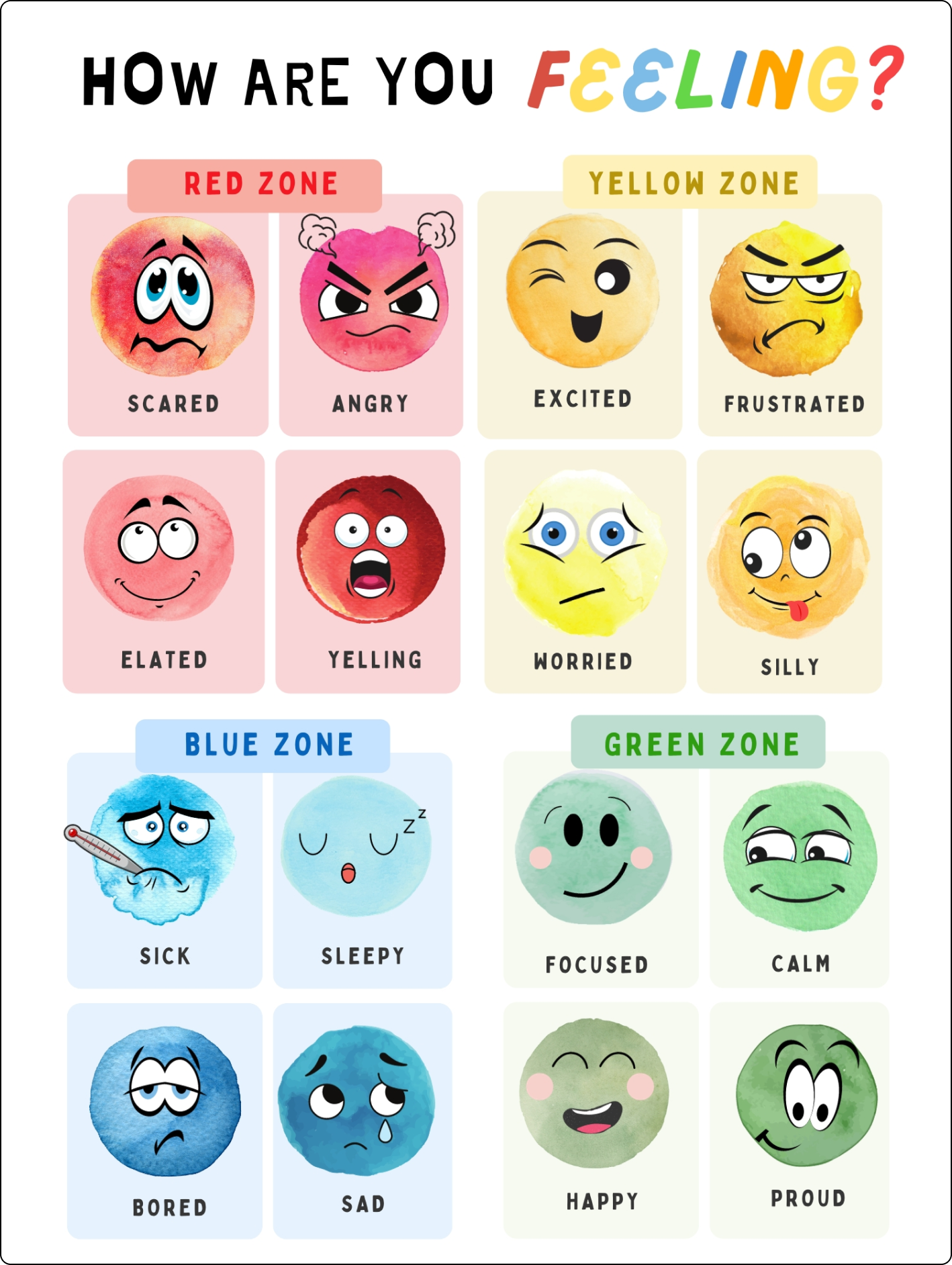
Inspired by the persona, it became clear that teachers need a more efficient way to assess students' emotional states. With large classes and demanding schedules, checking in individually is a challenge. Currently, teachers rely on time-consuming conversations or observations. To address this, I turned to the Zones of Regulation, a popular framework that uses color-coded zones to help students understand and manage their emotions. I began developing solutions to streamline this process and make it more effective for teachers.
POV: I’d like to explore ways to help teachers of grades k-8 to collect information about the social emotional status of their students so that they can better support them in the classroom.
HMW: How might we collect information about students’ social emotional status?
Product Roadmap
As I began developing a solution, I focused on outlining the various features my product would need to include. To ensure a clear direction and prioritize the most essential elements, I organized these features into four distinct categories. This structured approach allowed me to identify which features would deliver the greatest value and address the core needs of the target audience.
Must Haves
Logging in
Reports section
Individual student data
Strong emotion detection
Class list
Class data
Students submitting emotions on a student platform
Nice to Have
Request teacher conference
Assignments section
Video lessons and assessments
Surprising and Delightful
Messaging
Mindfulness videos
Body breaks
Focus building activities
Can come later
Student view
Administrator view
Sitemap
I created a sitemap to structure the platform’s information architecture with teachers’ needs in mind. The design ensures that key information is accessible and easy to navigate. The pages within the user flow I am planning are as follows:
Homepage: Displays a summary of important class reports, providing teachers with a quick overview of their class.
Detailed Reports: Teachers can select any report to view more in-depth data, including a student list with individual summaries.
Student Reports: Selecting a student shows their individual report, highlighting patterns in mood boards, assessment results, and calming strategies.

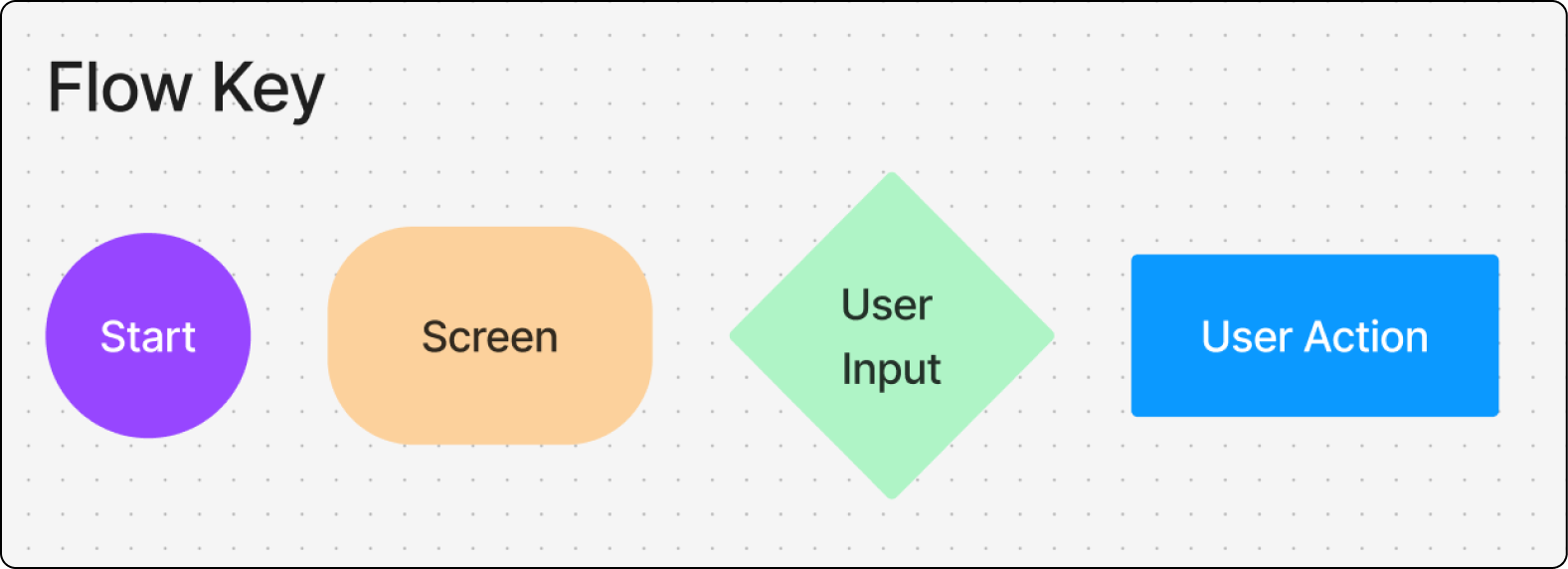
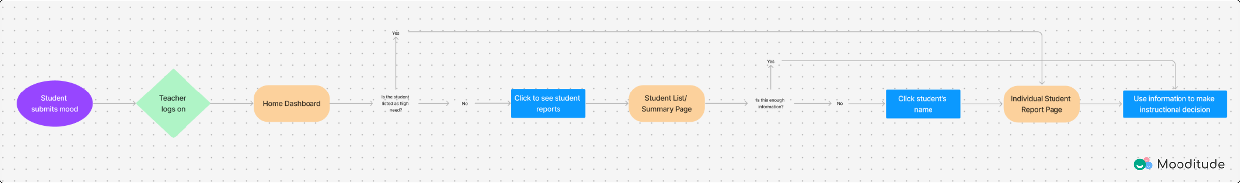
User Flows
Based on the needs of the personas, the following User Flow was created. This flow helps teachers support students logging challenging emotions:
Navigate to and view detailed data on the individual student page.
Assign helpful activities for emotional management.
Facilitate supportive in-person conversations.
User Flow: Assign an Activity to a Student in Need (See User Flow)
Phase 3: Interaction Design
Process: Low Fidelity Sketches
Wireframe Sketches
Possible Dashboard Screens
By including containers for each element on the dashboard, I improve visual organization and make it easier for users to distinguish between different sections.
I designed the class mood board to display student data as they check in their moods throughout the day, providing teachers with real-time insights.
I chose not to include a class list on the main dashboard to maintain a clean information architecture and ensure the user could navigate the interface with ease.
I utilized upper navigation to maximize space on the main screen, ensuring teachers have ample room for the essential elements they need.


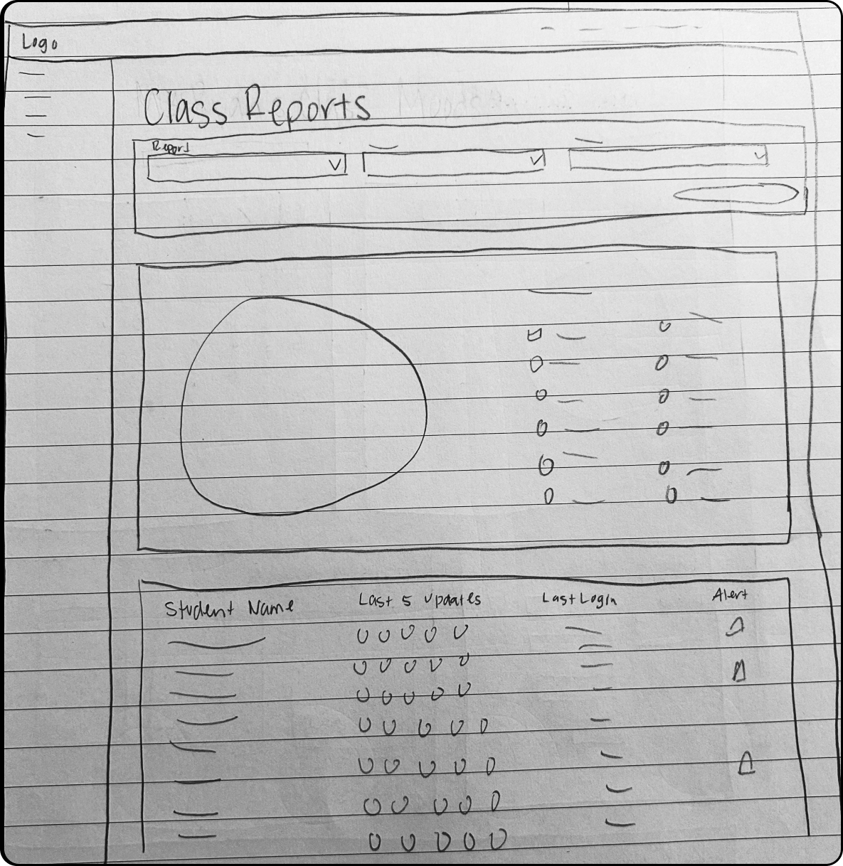
Possible Class Report Screen
Drop downs would allow for teachers to select various reports based on their needs.
Class mood board (large circle) gives teachers a quick snapshot of the emotions of the class as a whole.
Students in need display an alert within the class list to signal to teachers which students need support.
Possible Student Report Screen
Option to select different time frames to see data from previous weeks.
Calendar provides an at a glance way for teachers to notice patterns within the students’ mood check ins.
Suggested activities are generated based on the student’s recent check ins and activity.

Phase 4: Design and Branding
Process: Moodboard, Style Tile, High Fidelity Wireframes
Branding

The design approach for Mooditude focuses on aligning with its core values of supporting emotional regulation and achievement for teachers and students. Key design elements include:
Color Palette: Soft greens with vibrant accents symbolize emotions, fostering a sense of safety, comfort, and joy.
Logo Design: A sans-serif font creates an approachable and secure feel for all users.
Familiar Elements: Face icons from student mood check-ins are integrated into the logo to ensure consistency across the platform.
Brand Values
Safe
Comforting
Uplifting
Warm
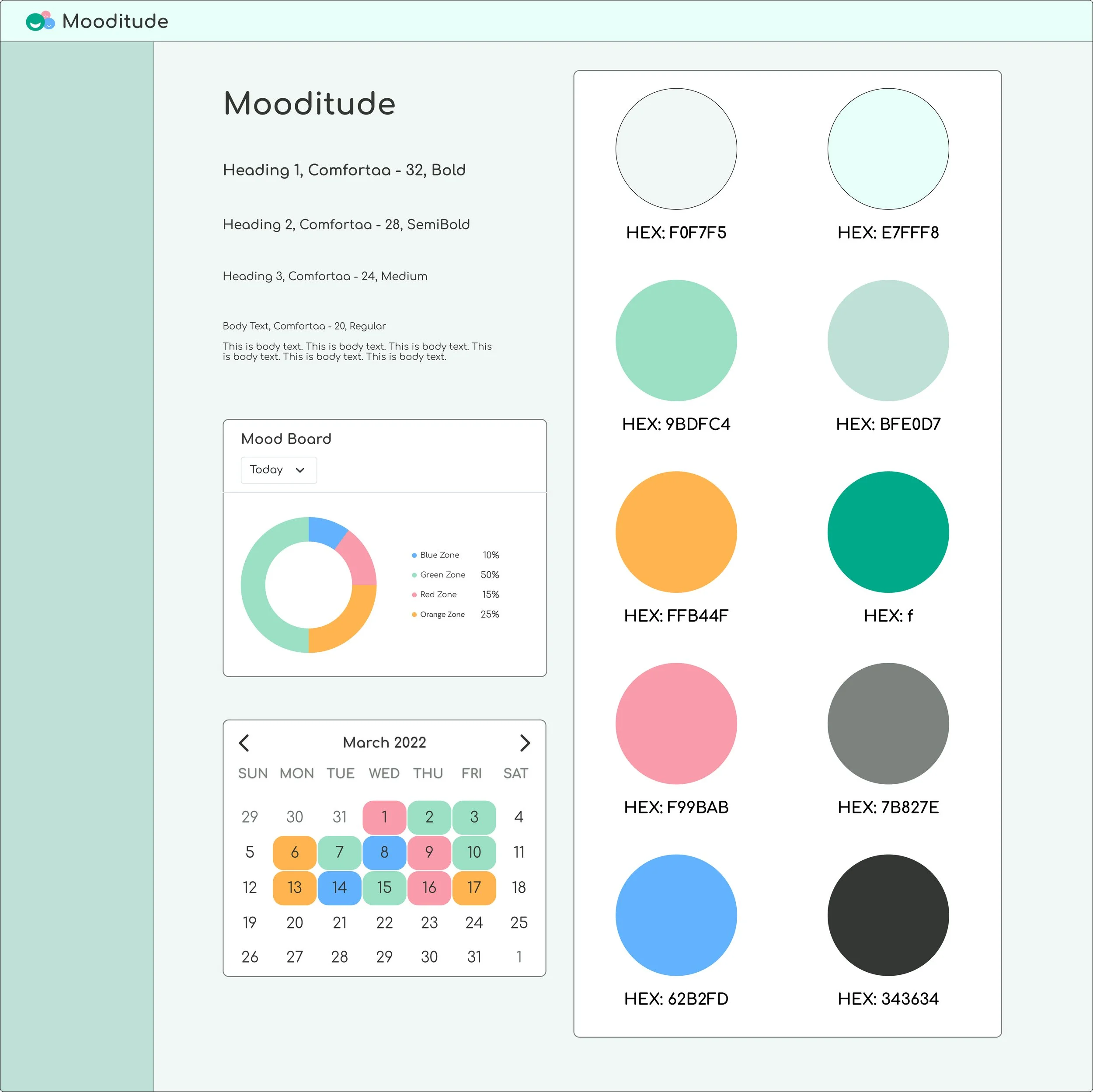
Moodboard

Style Tile and UI Kit
High Fidelity Wireframes
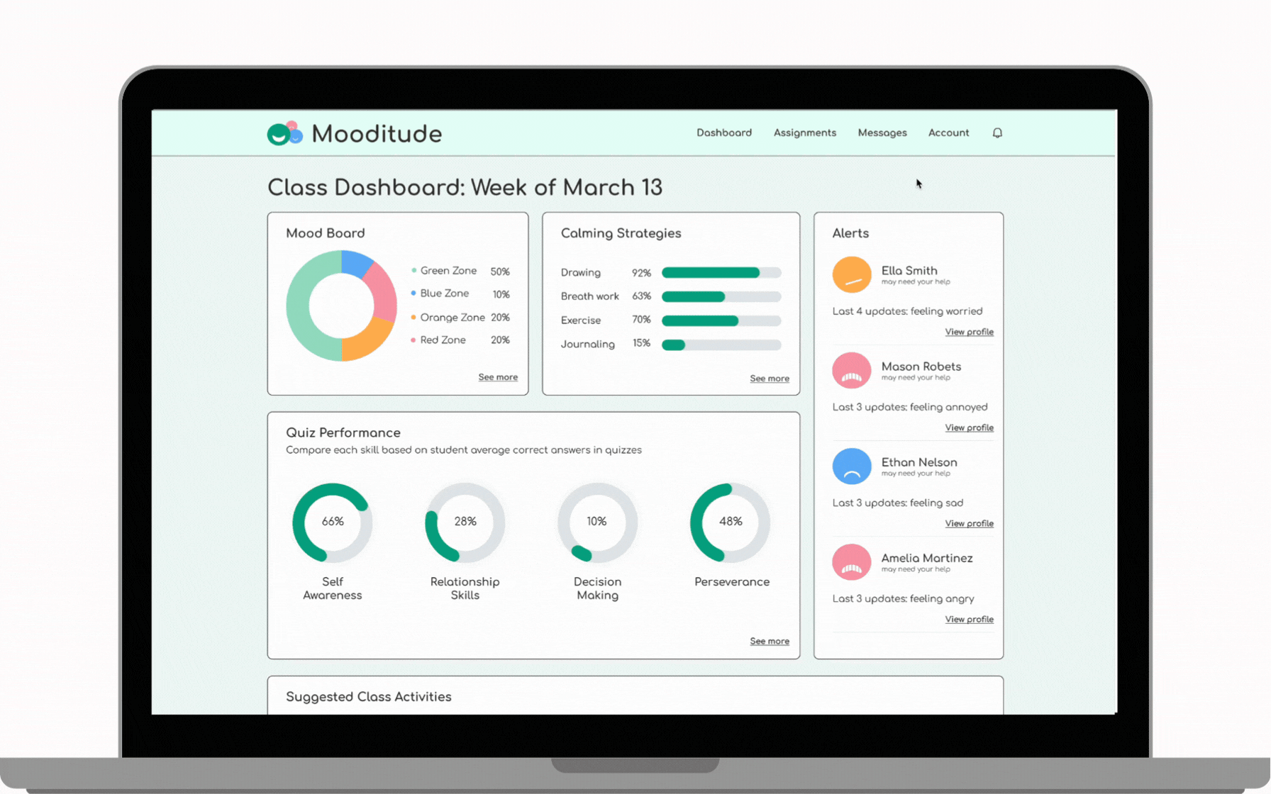
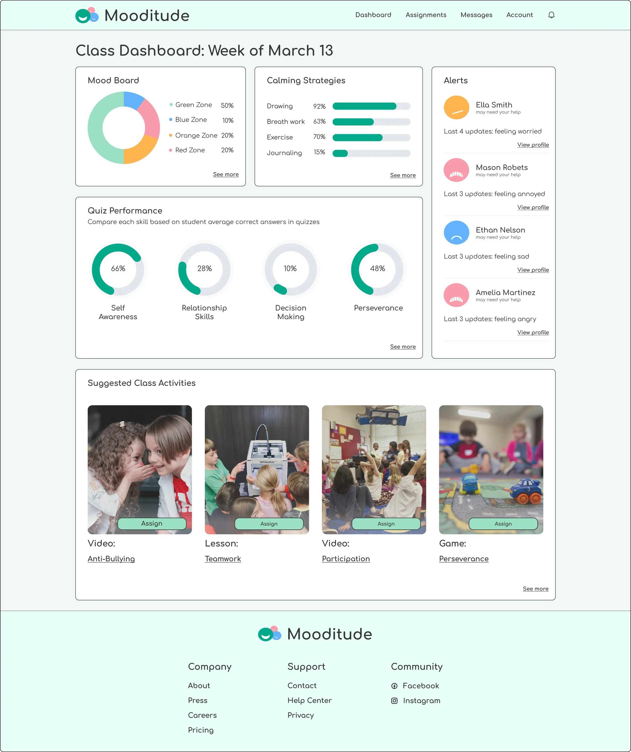
Class Dashboard
Placed the Mood Board at the top of the screen to prioritize it as a daily tool based on teacher feedback.
Placed the Alerts in a prominent, easily accessible location to ensure teachers can quickly identify and address the needs of high-priority students.
Quiz performance would be aggregated based on students' results from class activities, providing a comprehensive view of their progress.
Suggested Class Activities would be tailored based on student check ins and their overall performance on class activities, ensuring relevant recommendations.
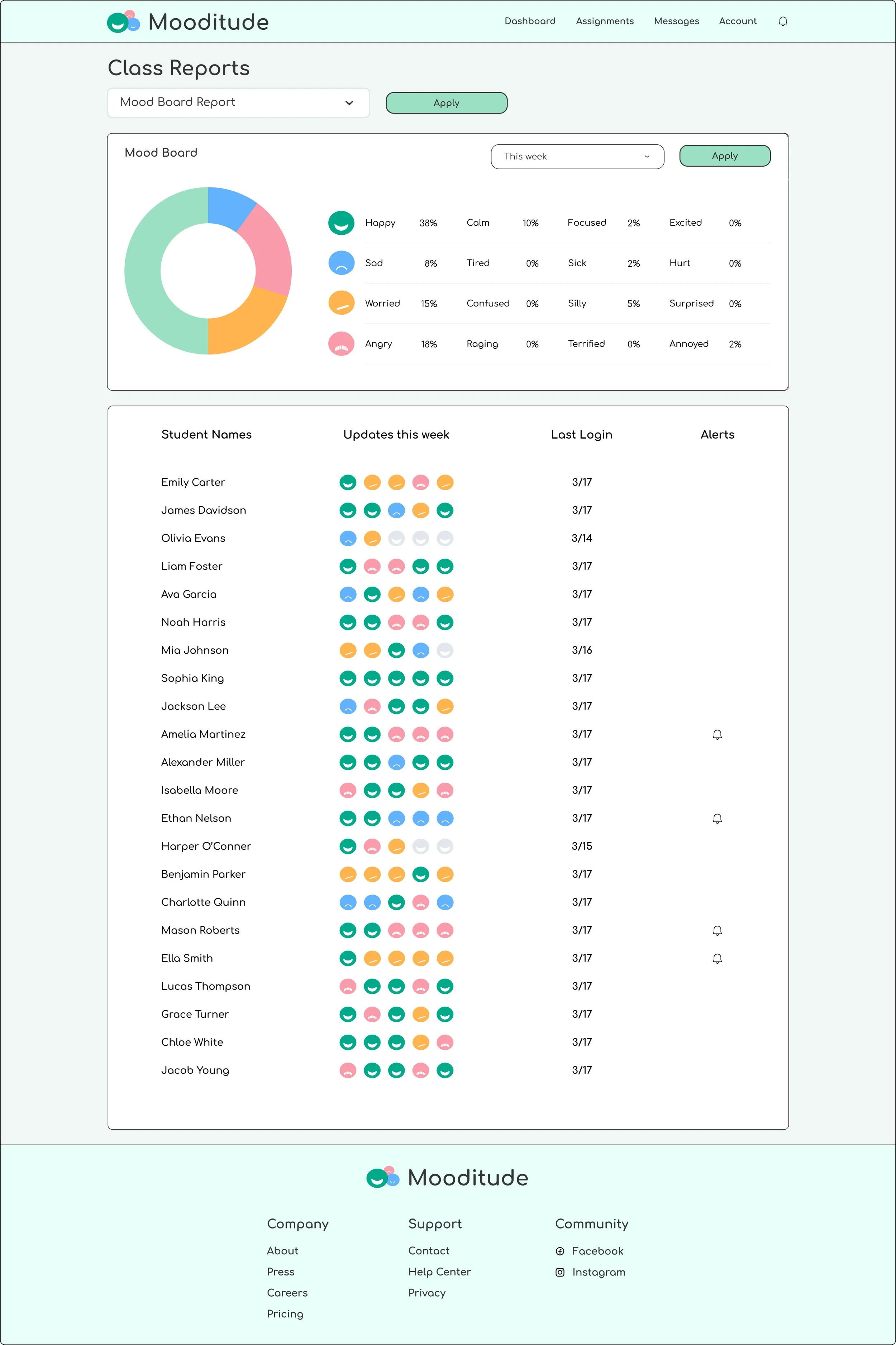
Class Mood Board Report
Utilized ‘Zones of Regulation’ colors and emotions that many teachers and students are familiar with to help regulate emotions.
Placed the detailed Class Mood Board report at the top of the screen to give teachers a quick overview of how their class is feeling.
Class list allows for teachers to see their students’ check ins for the current week, most recent login, and any students with alerts from the main dashboard
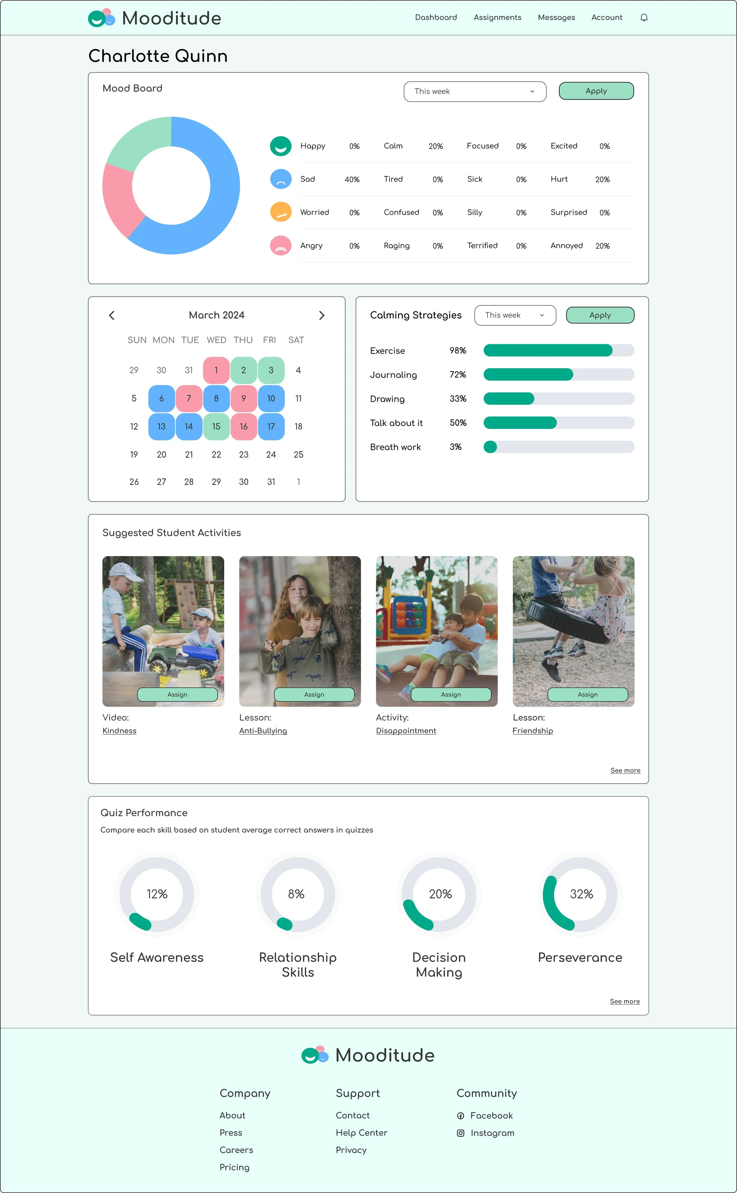
Individual Student Report
Placed a detailed Individual Mood Board at the top of the screen so teachers can quickly assess how an individual student has been feeling.
The Calendar provides teachers with an alternative way to easily spot patterns in student moods over time.
Calming Strategies offer teachers insights into which techniques students prefer when experiencing negative emotions.
Suggested Student Activities are generated based on a combination of student check-ins and activity performance, ensuring relevant and personalized recommendations.
Drop-downs allow teachers to adjust the time frame of the displayed data, offering more flexibility in viewing student progress.
Phase 5: Testing
Process: Usability Test Plan, Priority Iterations, Reflection, Next Steps
Usability Testing
To ensure the usability testing process aligned with my user persona, I carefully selected participants whose characteristics, needs, and challenges closely reflected those of the persona. This approach allowed me to gain targeted insights into the specific pain points and expectations of this user type. By focusing on the persona’s perspective, the findings from the usability tests were directly applicable to designing solutions that address their unique needs effectively.
Demographic
5 participants (all women)
aged 28-35
Task 1: Assign an activity to a student in need
Qualitative Goals
Determine if users understand that information architecture of the website.
Determine if users would use this website in their classroom.
Understand if users think anything could be added to meet their needs.
Quantitive Goals
Determine the rate of completion for each task, determine rate of user errors.

Test Results
Task 1: Assign an activity to a student in need
Successes
100% of users expressed that they really liked the alerts section of the dashboard
100% of users expressed that they really liked the calendar view for emotions
All users rated ease to assign an activity a 5/5
83% users thought information on class dashboard was useful
All users said they would use this in their classroom
Opportunities
66% users thought student names didn’t look clickable
83% users wanted more detailed info on what the colors mean on dashboard
33% users wanted to know what was bothering students (ex: something at home, something at school)
66% users wanted to be able to hover on the calendar to see more info
33% thought the Class Report Moodboard table was visually confusing
66% of users completed the task with 1 error
17% of users completed the task with 2 errors
“Being able to look back at previous weeks and spot behavior patterns would be super handy!”
-Jessica J.
Priority Iterations
I utilized a severity-to-frequency chart to assess and prioritize the value of my insights for the company. This approach allowed me to evaluate each point individually and accurately position it on the chart. Upon completing this process, it became clear that the key areas requiring iteration were as follows:
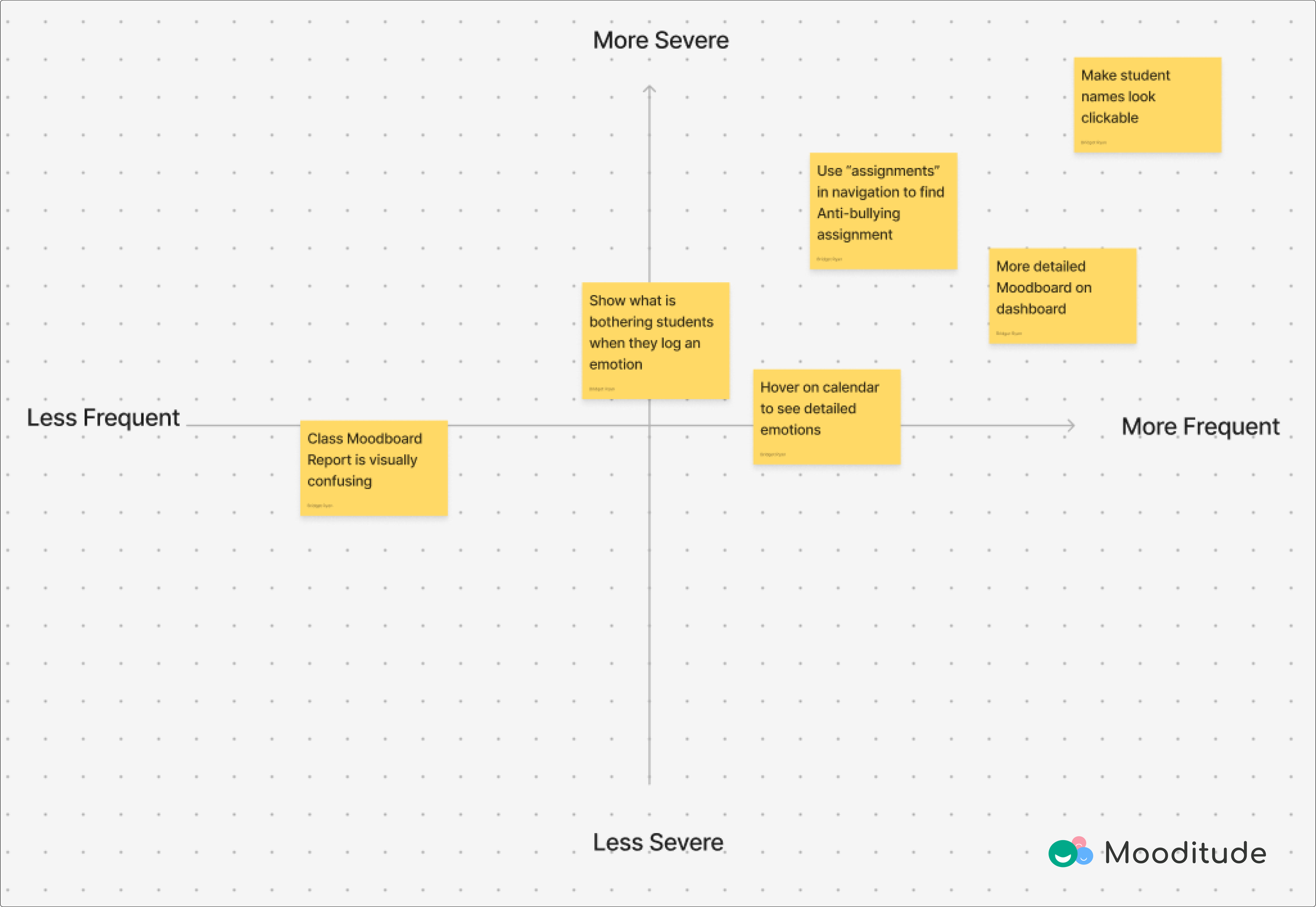
Make student names look clickable
Ensures clarity for teachers who are looking for individual student data
Add more information about the colors on the Moodboard
Helps new users easily understand the colors and their associated emotions, making it more intuitive for them to use.
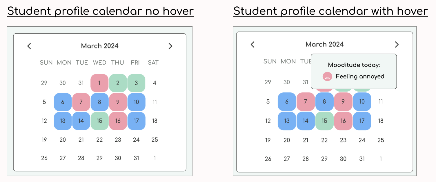
Add a hover feature to the calendar to see more detailed emotions
Displays the specific emotion a student is feeling instead of just the color, giving the user clear information without cluttering the screen.
Iterations before and after
User Feedback: 83% of users found the color meanings on the mood board unclear.
Solution: Added face icons to make the emotions more intuitive and easily recognizable.
Impact: This change improves the clarity of the mood board, providing a smoother user experience.

User Feedback: 66% of users didn’t recognize that the names were clickable.
Solution: Added a hover feature to clarify the names' functionality.
Impact: This update ensures users can easily navigate to individual student reports without confusion.

User Feedback: 66% of users wanted more clarity on the meaning of each color on the calendar.
Solution: Added a hover feature to display additional information about each color.
Impact: This update helps users understand the data quickly and without feeling overwhelmed.
Next steps
Additional Testing: Begin testing the iterations that have already been made.
Next priority Task Flow: Develop the other reports that would be useful for teachers and prepare them to be tested.
Peripheral Task Flow: Begin planning for the ‘Assignments’ section since 33% of users expected to go there to find the Anti-Bullying activity.
Reflection
This project strengthened my UX skills in research, design, and accessibility while emphasizing the value of thoughtful planning for intuitive designs.
Growth as a Designer:
Gained confidence in conducting interviews and usability tests.
Improved auto layout skills, especially modifying premade elements.
Applied accessibility techniques, like gradients to enhance button visibility.
Challenges and Solutions:
Struggled with information architecture and unclear user flows.
Resolved issues by creating a site map to streamline navigation and sketches.
Key Takeaways:
Authentic user interactions during interviews lead to better insights.
Early planning saves time and improves outcomes.
Accessibility boosts usability and design quality.